Londeree Technologies
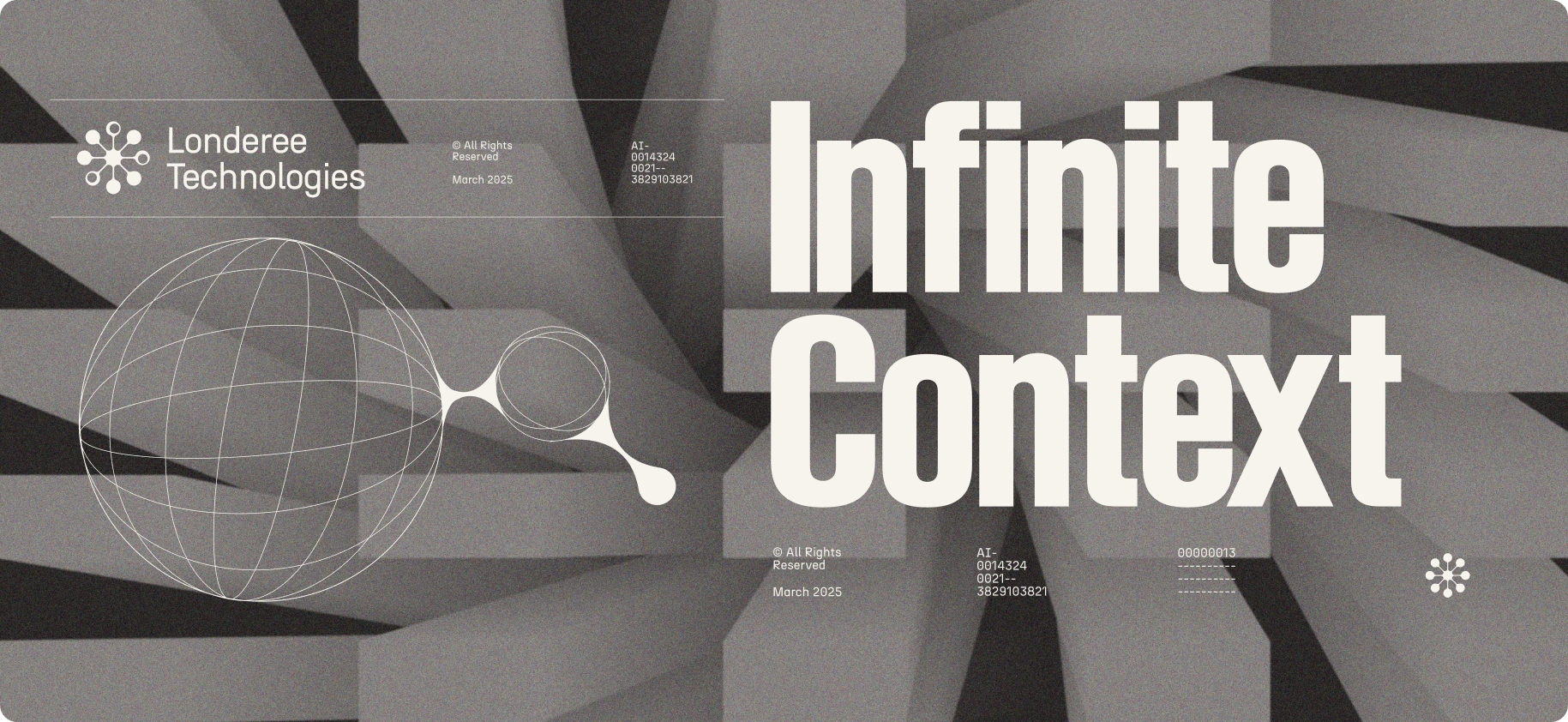
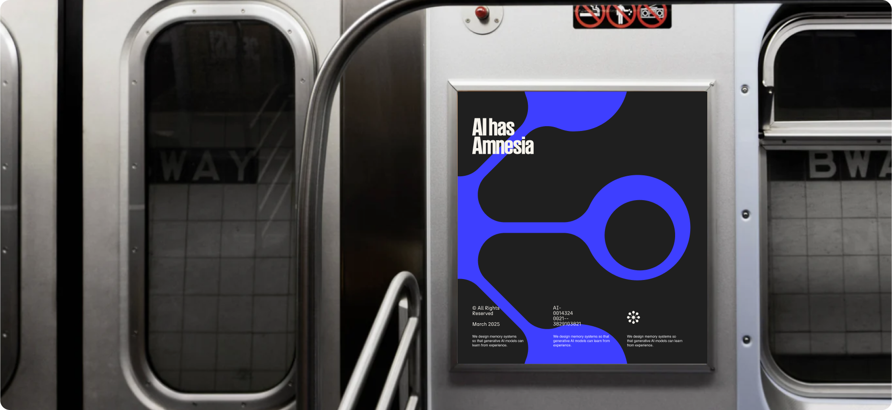
We set out to create a visual identity that draws from mid-century inspiration without feeling overly nostalgic. Grounded in the neurological foundations of Londeree Technologies, we incorporated diagnostic, brain-like patterns that reflect their approach to AI memory and learning. To complement this, we merged Bauhaus and Brutalist textures, balancing structure with bold aesthetics. The brand comes full circle with a space-age influence, refined into a sleek, modern look that propels it into the future of AI. By blending the fluid, interconnected forms of the logo mark with the structured depth of 3D illustrations, we achieve a seamless fusion of concept and execution. This full-circle approach not only reinforces the brand’s narrative but also establishes a distinct presence within the industry.
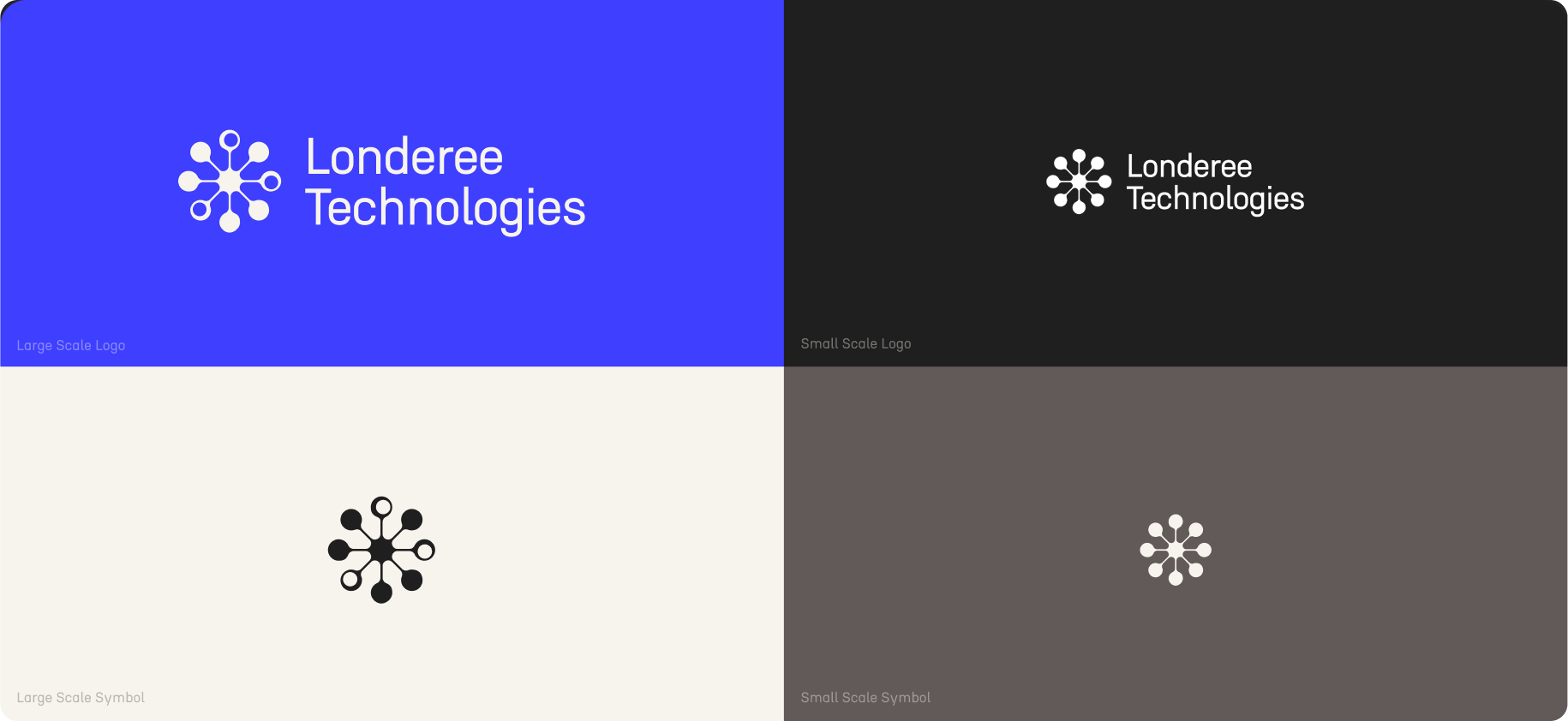
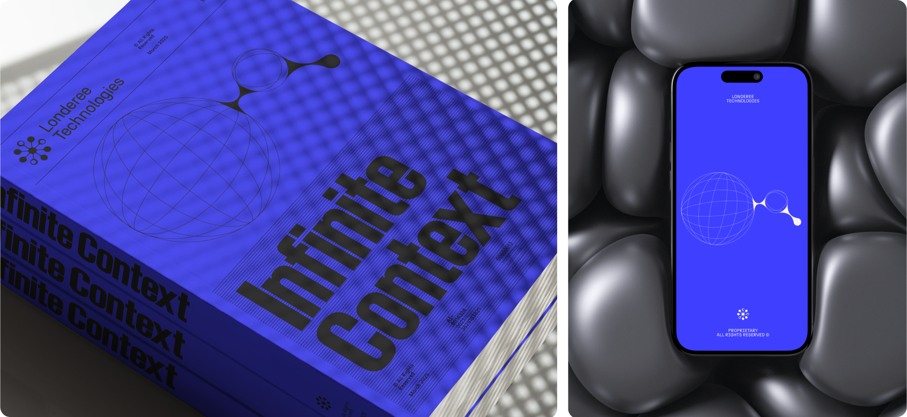
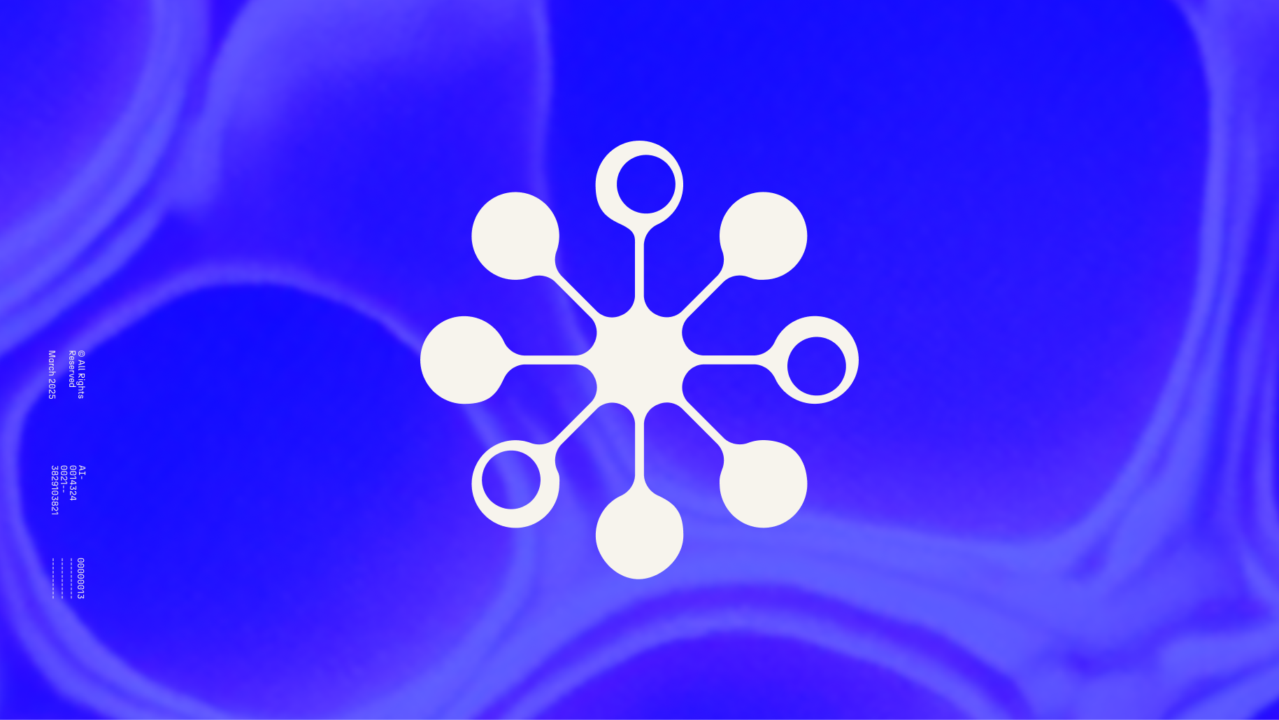
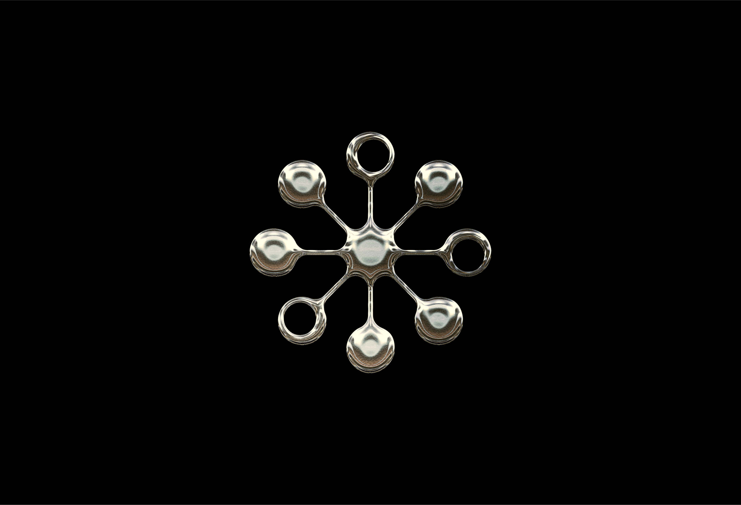
Our logo mark distinctively represents the neurological connections that form memory. Its circular structure, composed of fluid, rounded curves, visually symbolizes these intricate networks. The design subtly integrates retro influences, aligning with the brand’s overarching visual language. When paired with the geometric N27 typeface, it creates a cohesive and balanced identity.
Taking a closer look at the seamless connectivity it brings to the brand, the mark integrates the brand’s core emphasis on neurological connections with a smooth, space-age aesthetic reminiscent of the iconic mid-century Sputnik chandelier. Together, these elements illuminate the path for Londeree Technologies' innovation.
Studio
⦾ Curalli Studio
Role
Senior Designer
Deliverables
Visual Identity
Brand Guidelines
Pitch deck