Counter Foods
Counter is an emerging frozen food brand aiming to change the food game by creating a nourishing option for people on the go. No more fad diets and no more imposter products that promise a healthy meal, then don’t deliver. Instead, Counter offers a solution with macronutrient balanced meals that fuel each customer’s day - no matter what it throws at them. They needed a brand to launch their product and charm consumers into food they can count on.
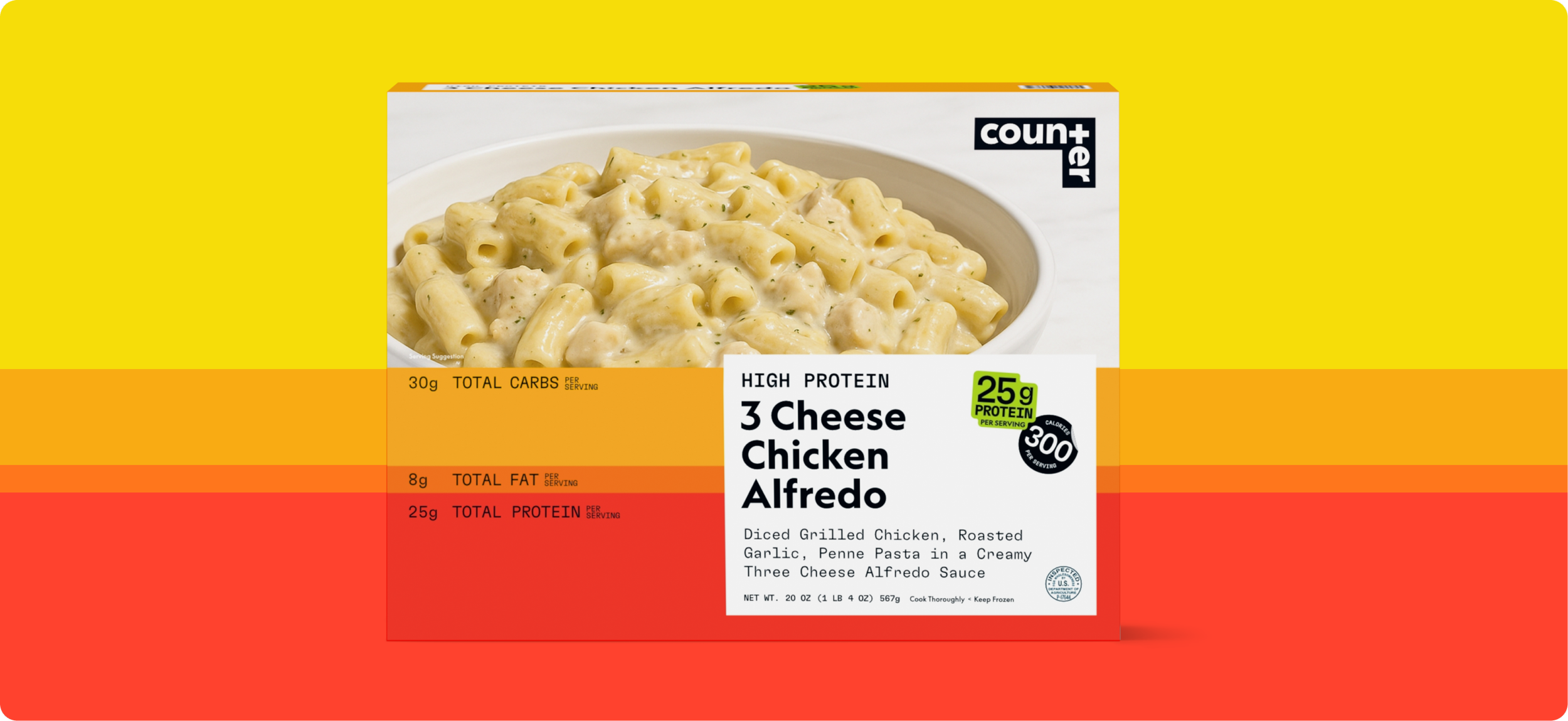
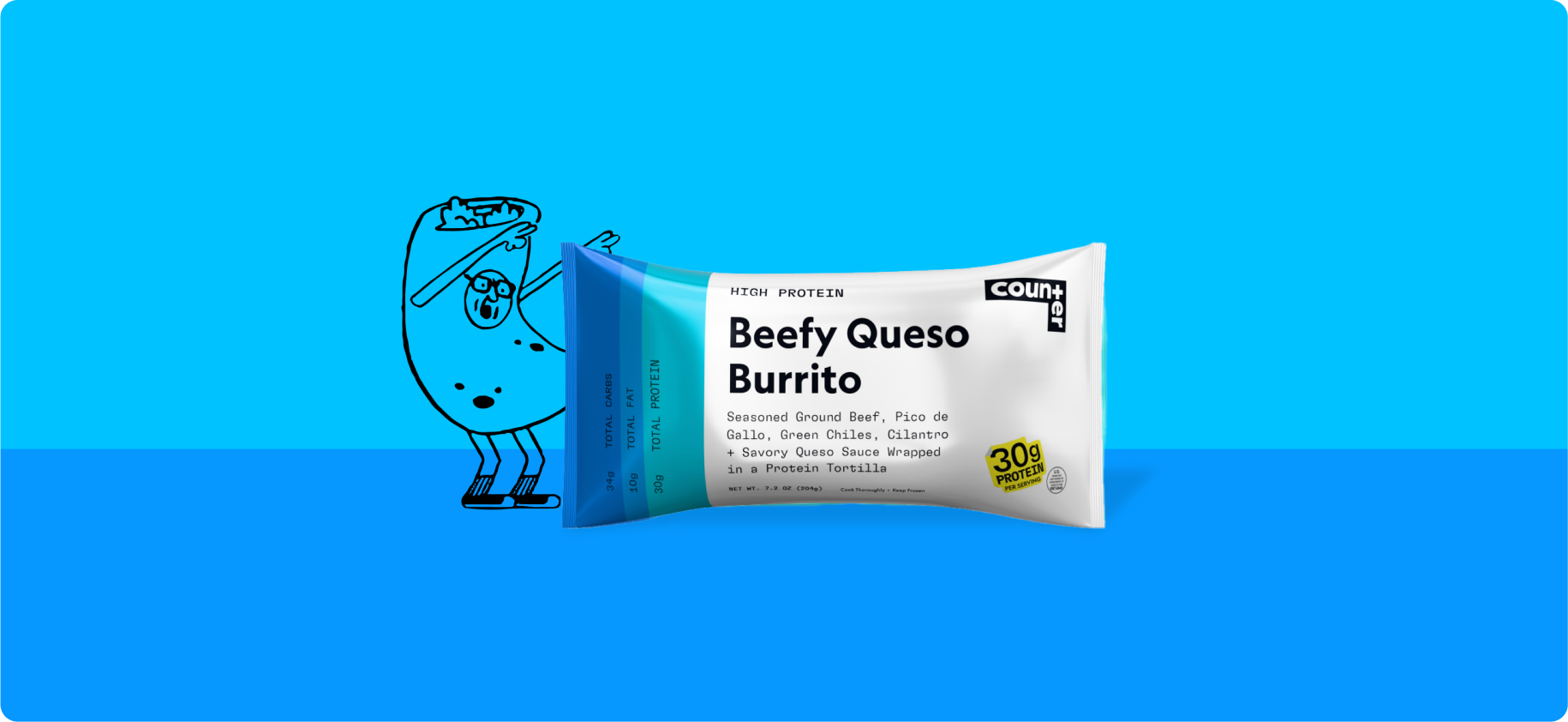
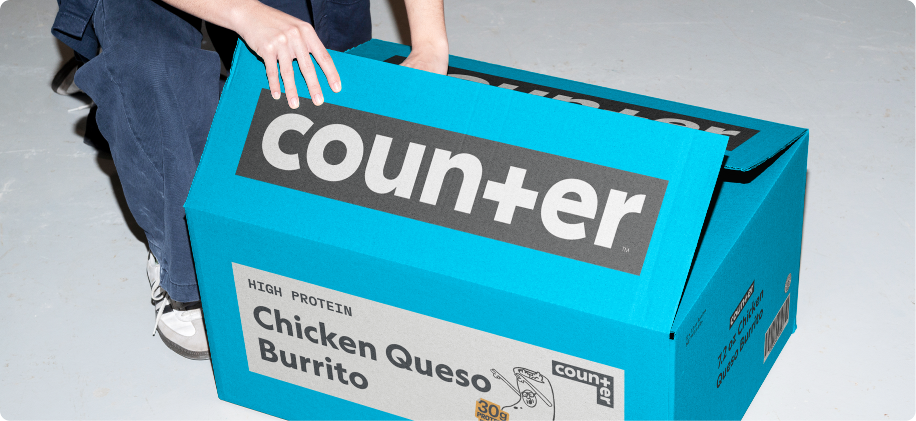
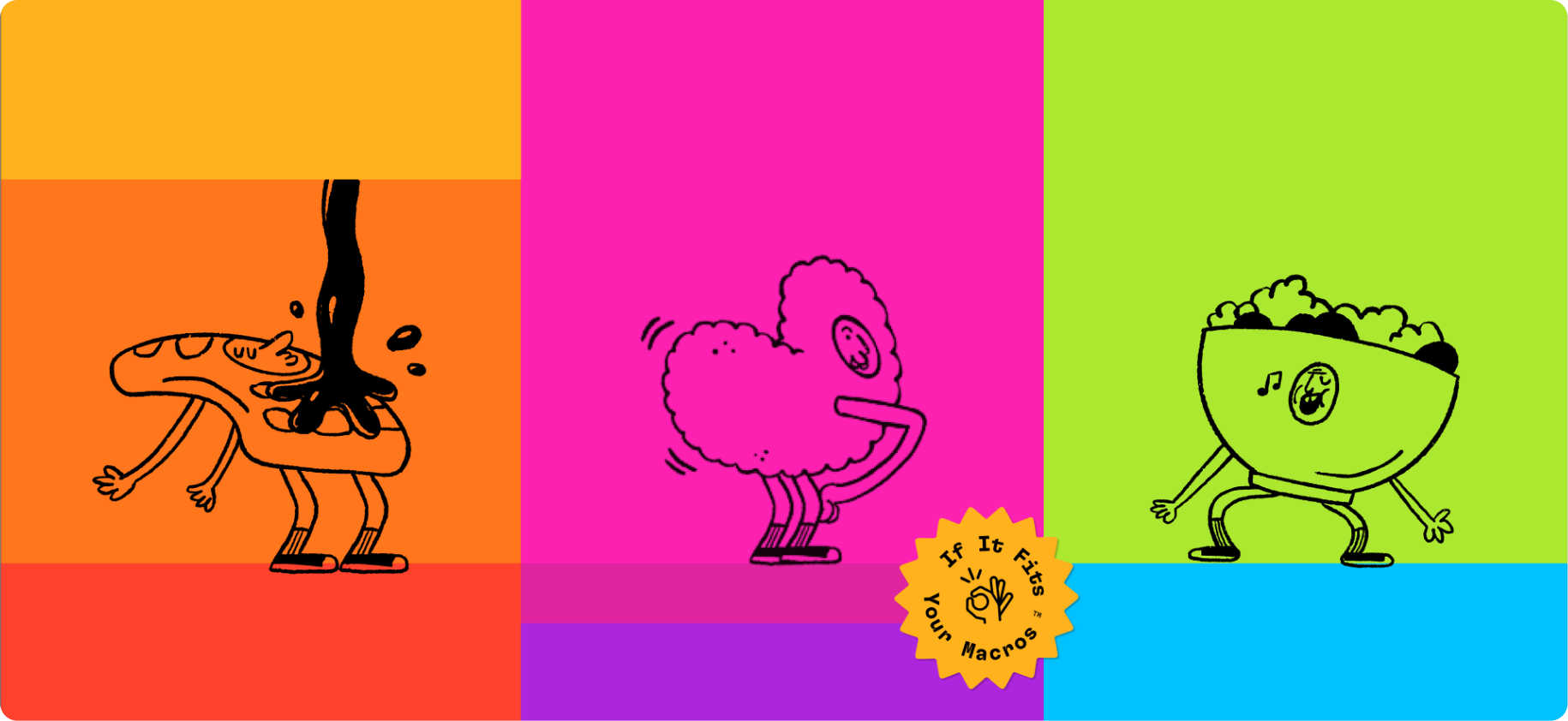
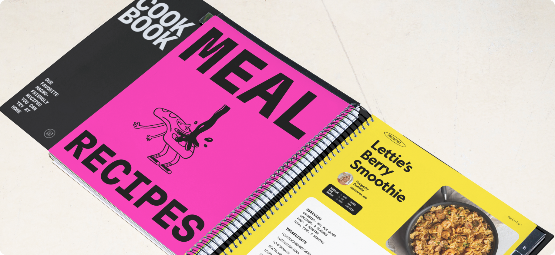
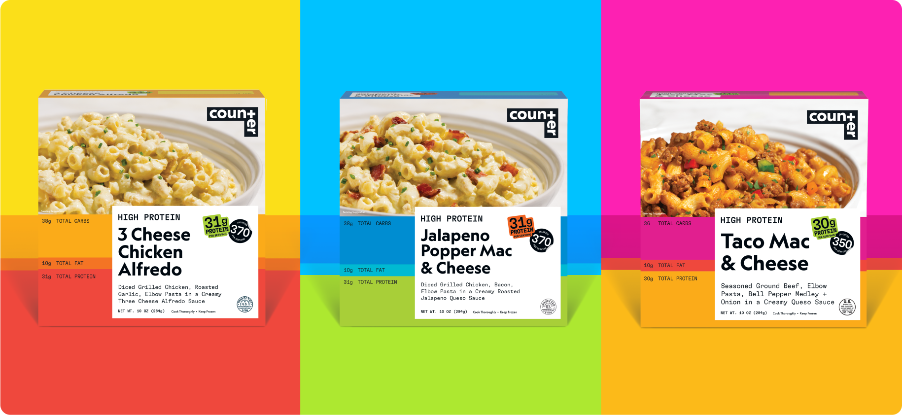
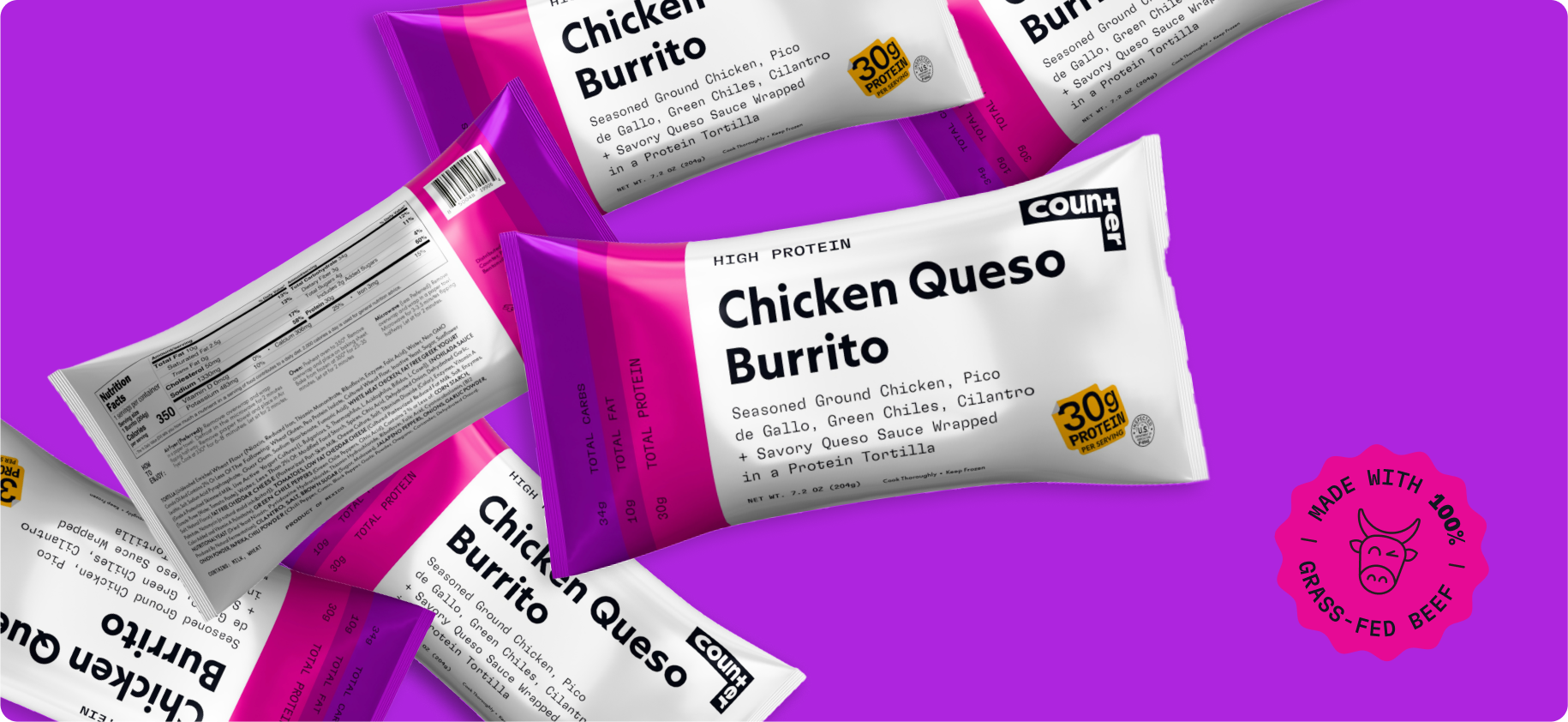
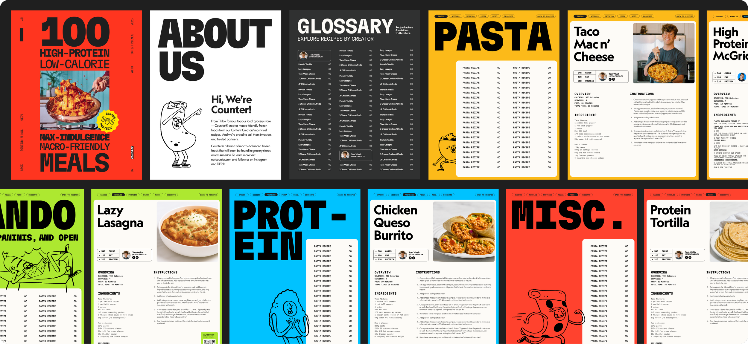
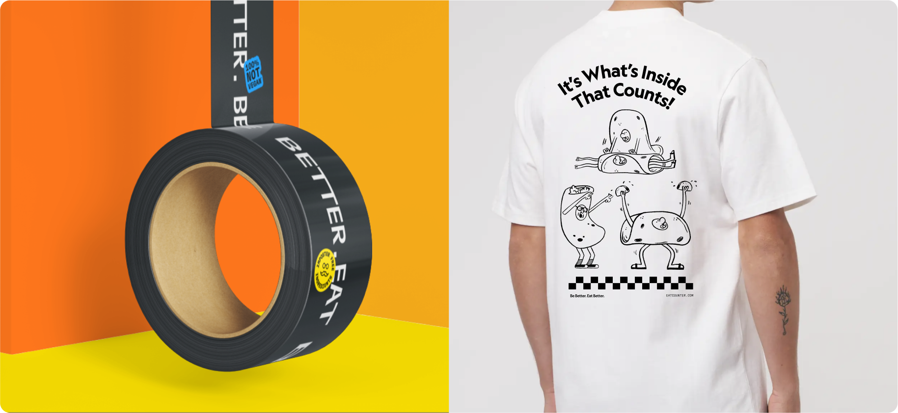
We created a brand strategy that made macro counting accessible to the average Joe (not just the gym bro) without sacrificing time and energy. From this we developed a benevolent but rebellious tone of voice and chose the name Counter. This carried into the visual identity seamlessly as the practicality of counting macros (Carbs, Fat, Protein) translated into a color blocking system that was both informational and engaging. We applied this thinking across the entire brand, using our macro-rule-of-thirds to guide color, photography, and even their packaging. A final step deeper into the brand brought cheeky illustrations and witty iconography so everyone can say goodbye to cruel and unusual nourishment and say hello to eating better (and being better).
Studio
⦾ Frank Collective
Role
Lead Designer
Deliverables
Brand Strategy
Naming
Brand Identity
Packaging
Brand Collateral
-
Creative Director: Chris Thomas // Copywriter: Mike Powers // Illustrator: Counter Foods
