American Awning Co.
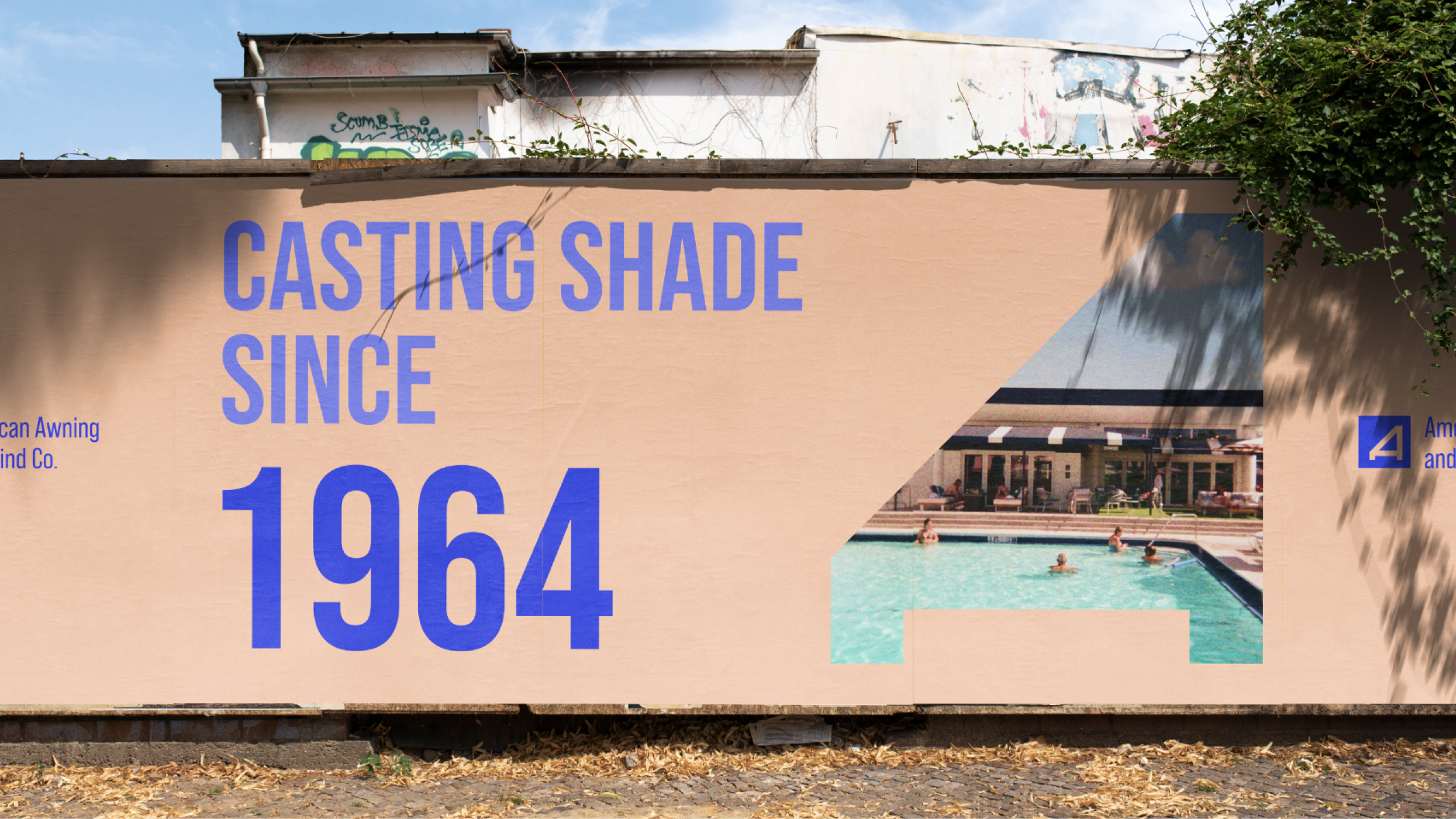
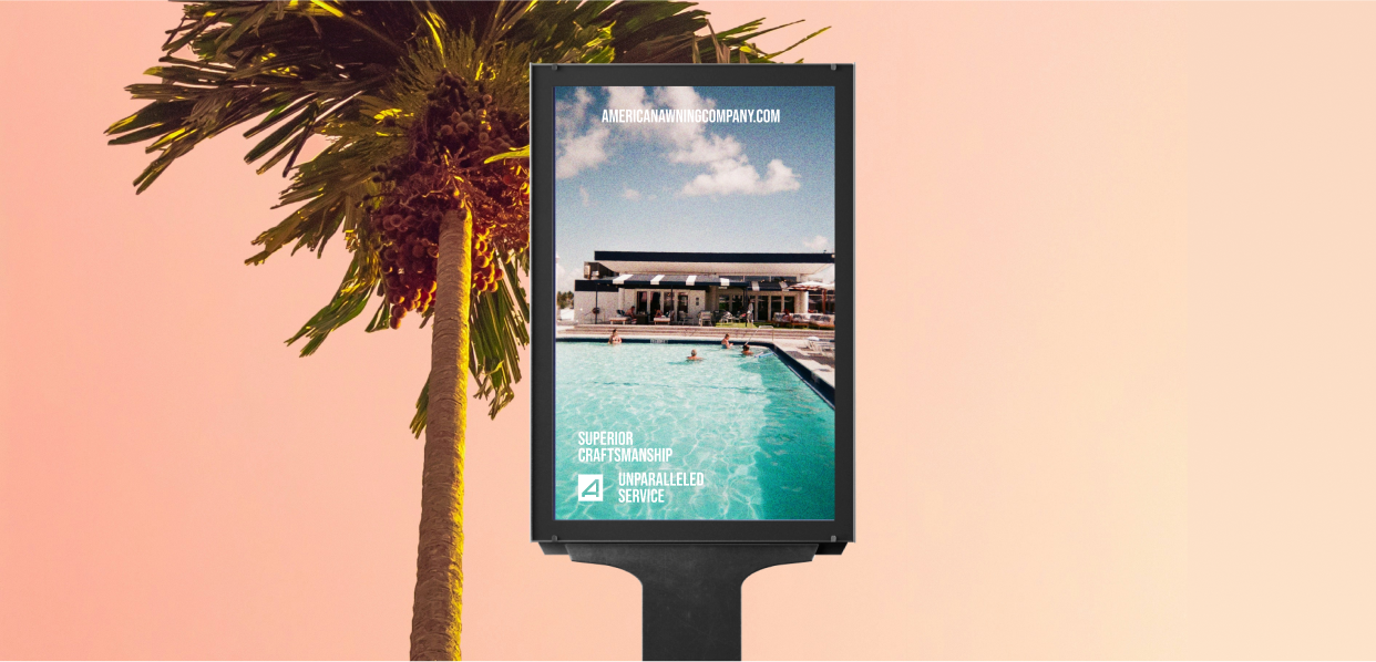
American Awning Company is a legacy LA brand that has–quite literally–brought shade all across Los Angeles. They sought a rebrand that elevated their logo, brought a stronger connection to their audience, and reflected the city they came from.
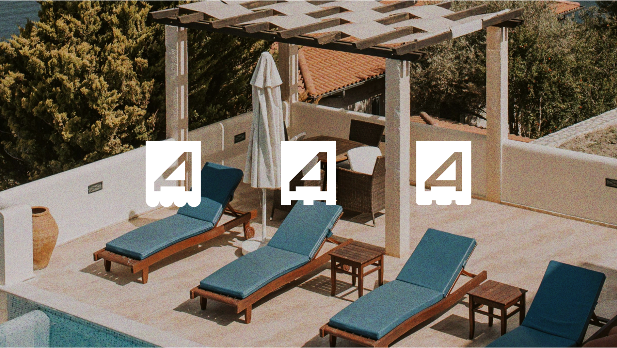
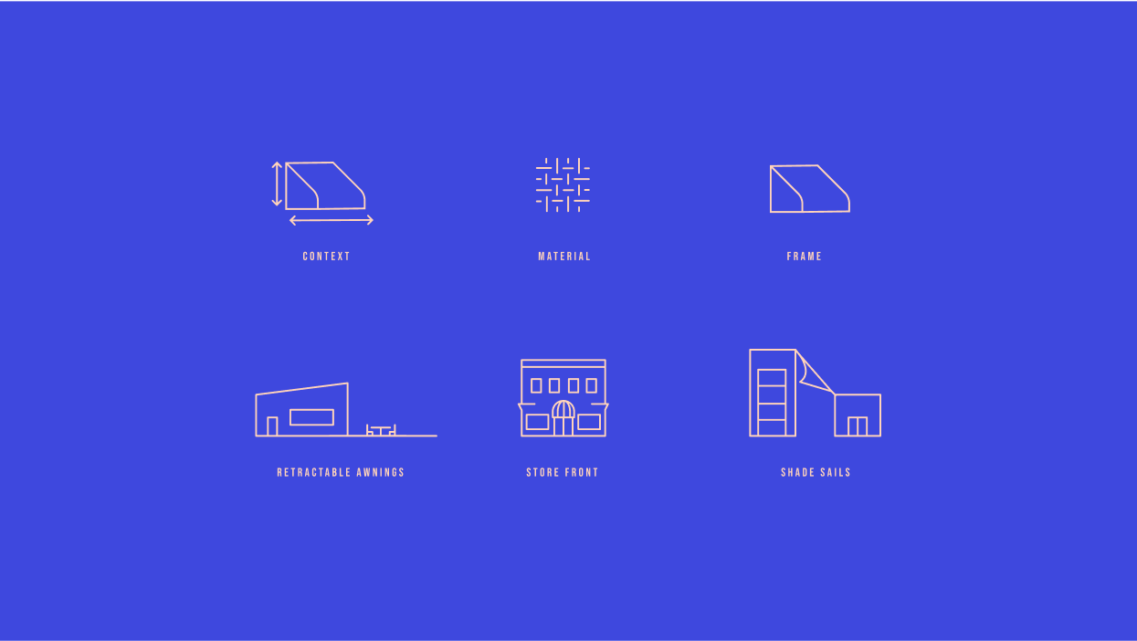
We created a dynamic brand that has the ability to stretch and transform just like their awnings. Starting with the logo, we simplified the original concept creating a logo still reminiscent of the original, while also bringing a strong connection to their product. By taking away many of the additional lines, we are left with a simple modern form that resembles both and “A” and an awning. This simplification allowed us to build in an adaptive system for showcasing the different types of awnings they offer. The new colors lean into a mid-century LA creating a vibrant retro palette that balances those sharp geometric shapes. Finally, a set of clean, linear iconography provides clear steps in choosing the right awning.
Studio
⦾ sophcuralli
Deliverables
Visual Identity
Brand Guidelines
2021


